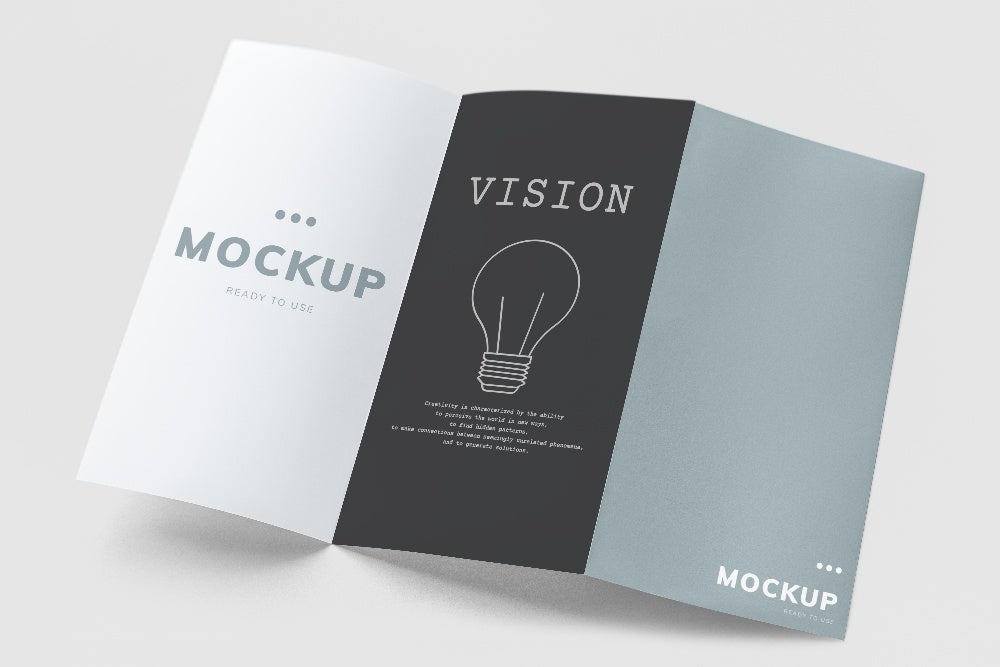
Brochure services are a crucial component of marketing, especially in a bustling city like New York, NY. Businesses face unique challenges when it comes to grabbing the attention of their target audience in such a competitive environment. This article aims to provide valuable insights on crafting effective brochures that resonate with the New York crowd and help your business stand out from the rest.
Best Brochure Formats for Different Business Objectives in New York, NY
When it comes to brochure design, selecting the right format is key. Different formats serve various purposes, and understanding how each one aligns with your business goals is essential.
| Format | Purpose | Example |
|---|---|---|
| Half Fold | Informational, concise overview | Restaurant menus, event programs |
| Tri Fold | Detailed product/service descriptions | Real estate listings, medical services |
| Accordion Fold | Showcasing step-by-step processes | Fitness programs, DIY tutorials |
Successful New York businesses often opt for formats that complement their industry and target audience preferences. For instance, a trendy Manhattan boutique might choose a sleek half-fold brochure to highlight their latest collection, while a financial services firm may prefer a tri fold format to provide in-depth information about their offerings.

How Compelling Visuals Enhance Brochure Effectiveness
Visuals play a vital role in capturing your audience’s attention and communicating your message effectively. High-quality images and graphics not only make your brochure more appealing but also evoke emotions and create a lasting impression.
Consider these tips when incorporating visuals into your brochure design:
- Use images that align with your brand’s identity and message
- Ensure that the visuals are relevant to your target audience
- Maintain consistency in style and color scheme throughout the brochure
- Optimize images for print quality to avoid pixelation or blurriness
Remember, in a city like New York, where people are constantly bombarded with visual stimuli, having compelling and memorable visuals in your brochure can make all the difference.
Key Elements of Effective Brochure Design
| Element | Importance |
|---|---|
| Format | Choosing the right format aligns with business objectives and audience preferences |
| Visuals | High-quality images and graphics capture attention and communicate your message effectively |
| Brand Identity | Ensuring consistency in design elements reinforces your brand’s identity |
| Target Audience | Understanding your audience’s preferences helps create a brochure that resonates with them |
| Call-to-Action | Including a clear and compelling CTA encourages readers to take the desired action |
Ensuring Brochure Design Aligns with Brand Identity
Consistency is key when it comes to branding, and your brochure design should be no exception. Aligning your brochure with your brand’s identity helps create a cohesive and recognizable image across all your marketing materials.
To ensure your brochure reflects your brand identity:
- Use your brand’s color palette throughout the design
- Incorporate your logo and other brand elements prominently
- Maintain a consistent tone and voice in the copy that matches your brand’s personality
- Choose fonts that complement your brand’s style and are easy to read
By infusing your brand’s essence into your brochure design, you create a stronger connection with your target audience and reinforce your company’s image in their minds.
Selecting Brochure Formats that Resonate with Your Target Audience
Understanding your target audience is crucial when deciding on a brochure format. Different demographics have varying preferences, and tailoring your brochure to their tastes can significantly impact its effectiveness.
Brochure Formats for Different Demographics
| Demographic | Preferred Format | Rationale |
|---|---|---|
| Millennials | Half Fold, Accordion Fold | Prefer concise, visually appealing content |
| Baby Boomers | Tri Fold | Appreciate detailed information and traditional layouts |
| Gen Z | Half Fold, Interactive | Drawn to modern, engaging designs with interactive elements |
| Business Professionals | Tri Fold, Booklet | Value comprehensive information and a polished appearance |
By selecting a format that appeals to your target audience, you increase the likelihood of your brochure being read and shared, ultimately leading to better engagement and conversions.
Common Mistakes to Avoid in Brochure Design
Even the most well-intentioned brochure designs can fall short if they include common mistakes. To ensure your brochure is effective and professional, steer clear of these pitfalls:
- Cluttered layouts that make the brochure difficult to read
- Poor-quality images that appear pixelated or unprofessional
- Inconsistent branding that confuses readers and dilutes your brand identity
- Lack of a clear call-to-action, leaving readers without direction
- Overcomplicated language or industry jargon that alienates your audience
By avoiding these mistakes and focusing on creating a clean, visually appealing, and user-friendly brochure, you’ll be well on your way to captivating your New York audience.
Why Effective Brochure Design Matters for New York, NY Businesses
In a city as fast-paced and competitive as New York, making a lasting impression on potential customers is essential. Well-designed brochures serve as a powerful tool for businesses looking to stand out from the crowd and effectively communicate their value proposition.
Tips for Creating Effective Brochures in New York
| Insight | Action |
|---|---|
| Know your audience | Research your target market’s preferences and tailor your brochure design accordingly |
| Prioritize readability | Use clear fonts, concise language, and ample white space to make your brochure easy to read |
| Showcase your uniqueness | Highlight what sets your business apart from competitors in your brochure content |
| Provide value | Include useful information, special offers, or exclusive insights to incentivize readers to keep your brochure |
| Invest in quality | Partner with experienced designers and printers to ensure a professional, high-quality final product |
By implementing these actionable insights and focusing on effective brochure design, New York businesses can better connect with their target audience, drive engagement, and ultimately achieve their marketing goals.
Why We Think This Is Important

At Direct Mail Xperts LLC, we understand the power of well-designed brochures in achieving marketing success. With over 40 years of experience in the industry, we’ve seen firsthand how investing in high-quality brochure services can help businesses thrive, especially in a competitive market like New York.
We encourage businesses to prioritize thoughtful brochure design and partner with experienced professionals who can guide them through the process. By doing so, you’ll be better equipped to create brochures that resonate with your target audience, effectively communicate your brand’s message, and drive meaningful results for your business.
FAQs
What are the best brochure formats for different business objectives in New York, NY?
The best brochure formats depend on your specific business objectives. Half-fold brochures are great for providing a concise overview, tri-fold brochures allow for detailed product/service descriptions, and accordion-fold brochures are ideal for showcasing step-by-step processes.
How can compelling visuals enhance the effectiveness of a brochure?
Compelling visuals capture attention, evoke emotions, and communicate your message effectively. High-quality images and graphics that align with your brand identity and resonate with your target audience can significantly enhance the impact of your brochure.
What elements should be included to ensure the brochure design aligns with brand identity?
To ensure your brochure aligns with your brand identity, incorporate your brand’s color palette, logo, and other brand elements consistently throughout the design. Maintain a tone and voice that matches your brand’s personality and choose fonts that complement your brand’s style.
How do you select a brochure format that resonates with your target audience?
To select a brochure format that resonates with your target audience, research their preferences based on demographics. For example, millennials tend to prefer concise, visually appealing half fold or accordion fold brochures, while baby boomers appreciate detailed information in tri-fold formats.
What common mistakes should be avoided in brochure design?
Common mistakes to avoid in brochure design include cluttered layouts, poor-quality images, inconsistent branding, lack of a clear call-to-action, and overcomplicated language. By steering clear of these pitfalls, you can create a professional and effective brochure that engages your audience.
